The intake may require more than one session.
← HealthTech product ecosystem
Case 02 · Architecture · Trust · Adherence
Supporting the patient before, during and after the consultation.
I designed a longitudinal experience so that preparing for care, understanding treatment and maintaining continuity felt like parts of one process rather than disconnected tasks.
An experience that continues beyond the consultation
Patients need more than a place to submit information: they need to understand what is happening and what comes next.
In functional medicine, preparation may involve an extensive intake, medical history, documents and laboratory results. Afterwards, patients face new responsibilities: understanding instructions, organizing habits and medications, reviewing results and maintaining follow-up.
The experience needed to reduce that burden without hiding the required clinical depth or turning the patient into a form administrator.
02 / Problem
The core tension
Care requires depth, but the experience still needs to feel manageable.
Too many questions and documents can lead to abandonment.
A complex strategy must become clear actions.
Open tasks should not remain scattered across modules.
Design questionHow might we provide clinical depth without patients losing orientation, trust or the ability to continue?
My work
I designed the journey as a continuous relationship, not a collection of screens.
I organized the product around moments and needs, with consistent access to appointments, history and treatment.
I divided clinical data capture into progressive steps with pause, resume, visible progress and assisted responses.
I translated the therapeutic strategy into schedules, categories, instructions and next steps.
I incorporated states, confirmations, non-diagnostic language and a clear distinction between medical information and AI support.
I documented flows, empty states, permissions, rules and exceptions to prepare implementation.
The longitudinal structure
Four connected moments, each with a clear next action.
Navigation keeps the full history available while the home view highlights what the patient needs to address now.
How friction was reduced
Decisions that support orientation and adherence.
Progress, not pressure
The intake can be paused and resumed. Visible progress reduces uncertainty in a process that takes time.
Recognition over recall
Suggested responses, selectable options and voice support reduce the need to type.
Information for the moment
The home view prioritizes what needs attention today; details remain available without competing with the next action.
Tangible continuity
The prescription becomes schedules, open tasks and documents that remain available after the appointment.
An interface responsive to the moment
One visual language connects very different tasks.
An appointment, open question or priority instruction occupies the first level.
States and progress explain what remains without pressure or gamification.
Assistance is identified, explains its source and refers to the professional when appropriate.
Exploration for thinking and communication
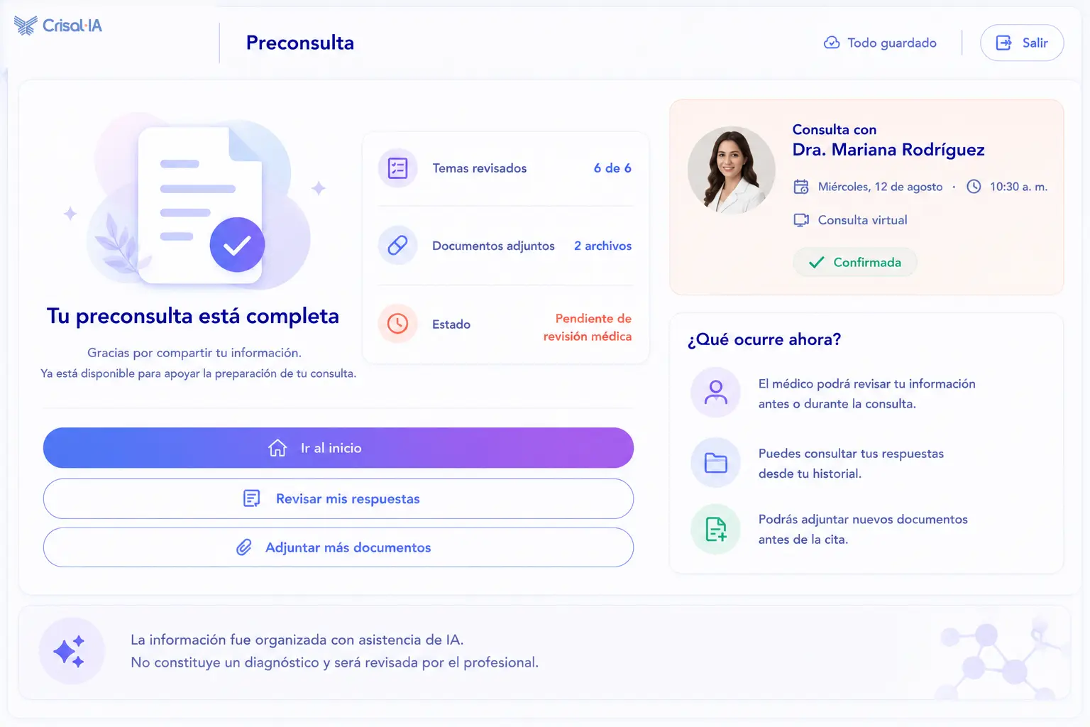
Explorations helped compare continuity, effort and orientation.
These views supported conversations about the complete patient experience. They were later refined to limit scope, reduce density and focus the first version on the next relevant action.
 Open larger image ↗
A completion state that confirms submission, explains professional review and keeps the next actions available.
Concept exploration · UX/Product direction · AI-assisted visualization08 / Tools
Tools tied to decisions.
- Figma
- Flows, wireframes, UI, prototypes and components.
- FigJam
- Service map, touchpoints and architecture.
- ChatGPT + GenAI
- Exploration, microcopy, documentation and critique.
- Functional definition
- Rules, states, permissions, exceptions and handoff.
09 / Outcome
Verifiable design outcomes
A connected experience ready for validation.
- A unified journey from registration through follow-up.
- A progressive intake with pause, resume and reduced input effort.
- Hierarchy based on next actions rather than internal modules.
- Treatment translated into understandable instructions and schedules.
- Consistent patterns for states, documents, appointments and support.
The product remains in development; these are architecture and design outcomes. Adherence and abandonment must be measured after implementation.
What this case reinforced
Continuity is not achieved by adding reminders. It begins when each moment helps people understand what happened, what comes next and why it matters.
The next stage should validate intake abandonment, understanding of the plan and whether patients can identify their next action without help.
Next case
Physician Workspace.
Presenting information and professional control without building an overwhelming interface.